So I haven’t written anything on this subject yet but I’m actually an outspoken feminist and feminism and sexism in the games media is a topic that I’m very interested in. Because of this I’ve been thinking for a while about writing about the topic, maybe doing some form of art critiques or commenting about the state of the industry. It is of course a topic that has been discussed heavily already but as I see it the issue is still far from resolved and hopefully I can somehow add something to the discussion.
As I was googling the topic I came across this article and I really felt that I wanted to comment it so maybe this is a start for more articles of this type on my blog, we’ll see. I’ll let it be my excuse for writing my first post on this topic. I’ll probably be citing the author of the article some of the time, but it might be easiest for you to just read it yourself before continuing here, it’s up to you. I want to say that I do not know the author nor am I completely familiar with the context of the article. It is not my meaning to offend anyone but I do think that this is an important topic to discuss and this article gave me somewhere to start.
When I started reading the article I first thought that me and the author seemed to be about at the same page. I do agree with many of the things she states in the article but as she goes on to rate images based of how sexist they are, I realize that we do not see things the same way. She starts with a definition of what sexism is (“prejudice, stereotyping, or discrimination, typically against women, on the basis of sex.”) and continues with saying that showing breasts or body parts in art is not sexist in itself but rather it is the context that determines if an image is sexist or not. This I can agree on. She also says that “what the character pictured is wearing has little to do with it.” which I’m not as prepared to sign up for since I believe that a characters clothing certainly can add or detract from whether I perceive an image as sexist or not. She continues with stating that it is the context of the image that is more important. I agree that context is very important but my meaning would be that clothing for example, can play a huge part in if it fits, or not fits, with the context.
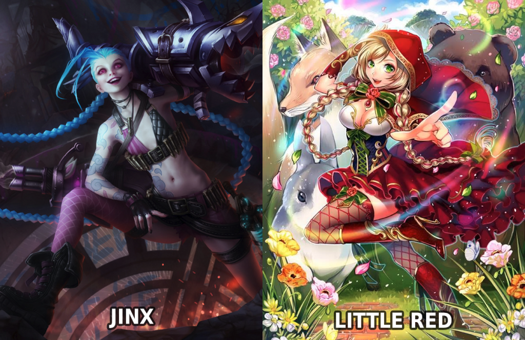
I realize that this post will be very lengthy if I comment the full text thoroughly so for readability’s sake I will just focus on the parts I most want to talk about. She mentions a character from the game League of Legends, Jinx, that has been praised for not being sexist, and compares it to Little Red, that apparently has been criticized, from the game Force of Will (image below). Her assessment is, however, that they’re almost exactly equal. She states that it’s strange that they are judged differently only because of Little Reds breast size when biology doesn’t matter. My answer to this would be that biology can matter, since women are almost always depicted with the same body type. Of course there is never anything wrong with an actual persons body, people can’t be blamed for how they look, but people that create art and content must still be held responsible for what they chose to depict. Being thin and having large breasts is displayed as the ideal female body and while Jinx also are not wearing much clothing she is at least an example of something different.

As I said I do agree with many of the ideas in the article so I’ll jump ahead to the point where I think it all takes a strange turn. Through the article she seems to want to deliver the message that context and body positioning is more important than, for example, clothing. In the last part of the article she goes on to “rate” a few cards from the card game Force of Will using the criteria that she’s set up. I think I’ll actually copy her full comments on the images in here and then do my own assessment.

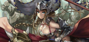
“Up first is Jeanne d’Arc, the Flame of Hatred. This character is deep in battle fighting for her cause. She is a ruler and thus the main feature of the image. Her body position is facing forward, ready to fight and eye sight is focused front. Her hands are holding weapons relevant to the battle (rather than fiddling with her hair or with a finger in her mouth). This character is posed and ready to strike, and gets an A+ from me: this image is not sexist.”
So basically, her rating seems to say that an image could not be less sexist than this. This is perfect in regards to the discussed topic. This seems very strange to me and I’ll go through the reasons why. She seems to focus on the fact that the character is facing forward and seems to somewhat fit into the theme, she’s equipped with weapons, and she’s participating in the battle. If these things weren’t true and the character, as she mentions as an example, would be fiddling with her hair or even have a finger in her mouth, I completely agree that this image would be worse. It’s just that for me those things would be far lower on the scale and the current state of the image isn’t nearly enough.
Even though I agree that it’s nothing wrong with the female body, clothing and armor is still not irrelevant when discussing sexism. If you look at the soldiers in the background they all seem to be wearing full plate armor but for some mysterious reason (not really) the main character leaves large parts of her body naked. I’m not saying that there’s anything necessarily wrong with showing parts of the female body, but as the author herself stated earlier in the article “context is key”. In a large scale battle where all things indicate that it’d be good to wear armor, and all other characters in the image are, you’d expect the character to do this as well. However, it is of course not hard to understand why this isn’t the case. The character has large pieces of armor missing because the artist wants us the see her breasts, a compromise that would probably not be made if the main character was male.
Sure, the parts of armor that the character is wearing look cool, but apparently they were not cool enough to cover her breasts. In my opinion, more energy has been put into making this character look beautiful than making her look fierce, dangerous or strong. I’m especially thinking about her calm face and eyes which doesn’t at all reflect the fact that she’s in battle and, as mentioned, her showing body parts. This is something that often happens to female characters in media, parts of their personality is sacrificed in order for them to look attractive.
Ok, next one.

“Next up is a selection of questionable Vingolf characters. These alternate art variants aren’t wearing much clothing, suggesting that maybe the characters have little to offer aside from sexuality, but are they sexist?
Similar to Jeanne, all three characters are facing forward with eyes on anyone who could engage battle. Both feet are planted on the ground and all three characters are fully capable of defending themselves. The clothing seems questionable as far as appropriateness. Being that the theme is fantasy, it is difficult to say what a musketeer would “typically wear” to battle. Let’s rule this one A-: probably not sexist.”
She does begin with saying that these are questionable, but once again rates the characters far higher than I think they deserve. It seems strange to me that she throughout the text seem to have quite a good idea of how sexist imagery works but later on seem to be unable to identify it in these images. To go through her comments: Yes, they are facing forward and are focusing on the viewer. However, focusing on the viewer doesn’t necessarily make a character more empowered. I usually find that more often it’s the objectified characters that are looking at the viewer while active characters are watching whatever they are occupied with. In my opinion both these and the above picture would have looked more active if they instead would have been looking at an enemy they are fighting (or something similar). Also none of their expressions look particularly ready for battle, more like happy and playful.
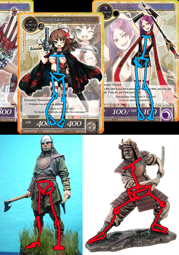
I’m not sure I agree that “both feet are planted on the ground”. I mean all their feet seems to touch the ground, sure, but they don’t seem to be standing very stable or, once again, “ready for battle”. The leftmost one is standing a bit more stable than the others but it seems to be because she’s playing a guitar so I don’t really know what to say. As for “fully capable of defending themselves” I guess she makes this assessment simply because they are holding weapons? To me their faces and overall expressions does not message strength or battle-readiness, they look mostly like they’re designed to look cute. I made a quick sketch below to show the difference between their stances and two examples that I’d say look more ready for battle. Notice how their knees are pointing inwards and with their feet together. That is not a pose that gives a lot of balance or shows confidence.

In regards to the clothing the author uses an excuse that I’ve seen used many times before that basically goes like “it’s a fantasy world so we can’t judge their looks from our standards, maybe it completely normal for them to look like this”. This makes me frustrated. Arguments like these could basically be used to excuse anything suggesting that all characters may as well run around naked constantly and this wouldn’t be strange at all. This is of course not the case. Yes, you could if you want construct a world where for some reason women are constantly naked but that doesn’t mean that it’s totally disconnected from our world or free from sexism. Images are not created in a vacuum, our world is also part of the context that this image was created in. Just as you would be wise to be careful when including racial themes and remember that colored people have been (and still are) oppressed by white people in our world you cannot pretend like it is not sexist to draw women in much less clothing than a male would (probably) have in the same position. If you’d like to hear more about this kind of argument you can follow this link to a youtuber that explains more.
Even in a hypothetical scenario where it’d be normal for them to be dressed like this it’s obvious that they are drawn like this to look good rather than any other reason. These three characters have very little clothing and what they have is not suited for combat. All this is not a coincidence and maybe I’m spending too much time explaining something obvious.They are drawn this way to be attractive and sexy and this is made at the expense of the power and strength these characters could have been given otherwise.
The context here is that women in a much larger degree in all of media and games industry are valued by their attractiveness rather than by their character or abilities and these images does nothing to differentiate from this. This is of course not just the fault of this artist or this game, it is an industry wide or even world wide problem, but at the same time all artists and producers must be responsible for what they create.
Ok, so what did you guys think of this? Is these kinds of posts interesting? I’m not sure about the demographic of posts like this yet so please tell me if you have any thoughts about how deep I go into the topic of these images (should I spend less/more time examining the details). Would you like if I wrote more or did you feel like you already knew the things I wrote about? I might do more stuff on the topic, we’ll see. Thank you if you read all the way here.

