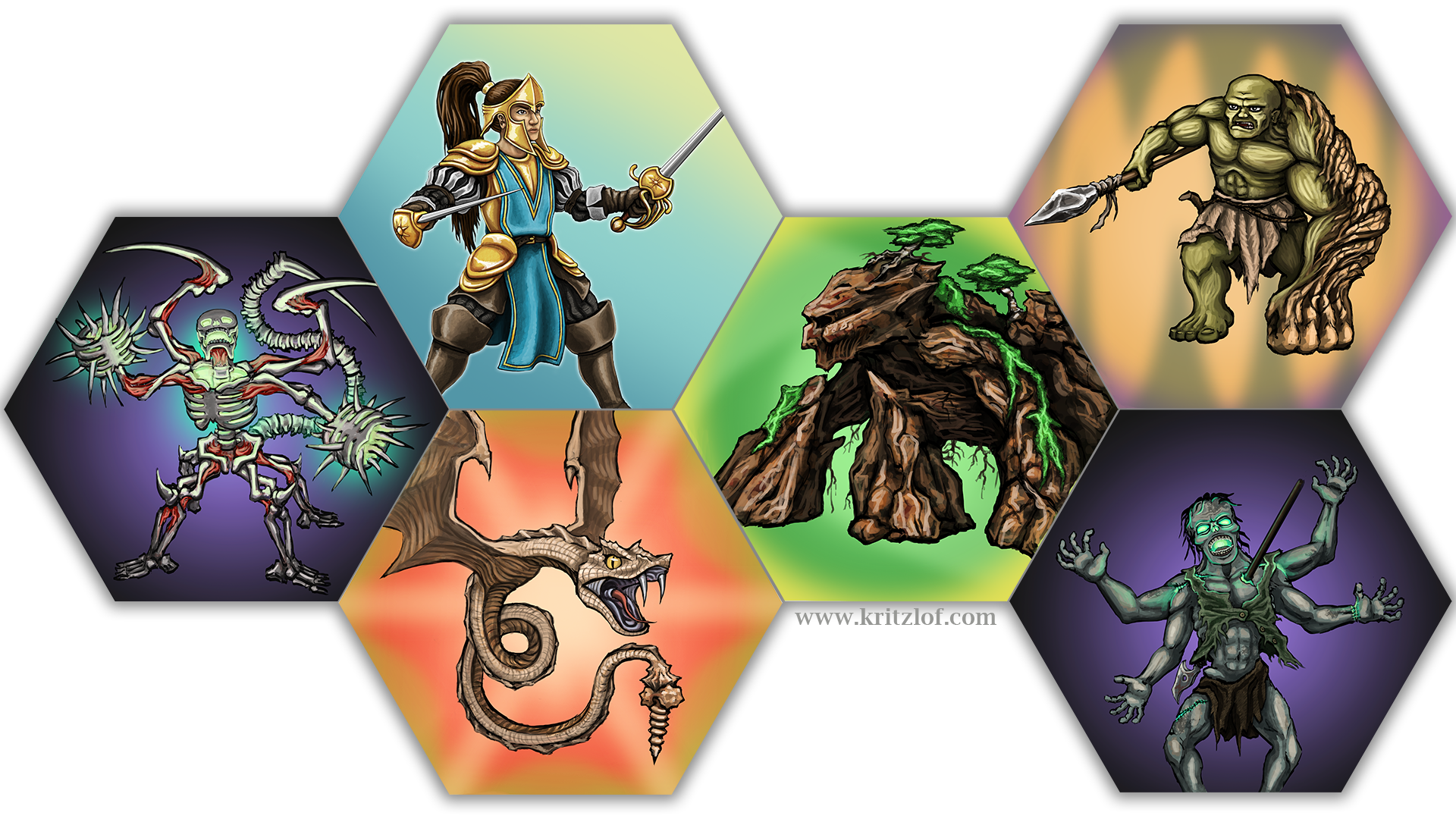
I thought I’d make a quick update and also show you guys some of the art I’ve been working on for the game.
The art in the Print-and-Play is, as mentioned earlier, all sketches and placeholders. This image is closer to what I’m looking for, although I might still put a bit more work into them. I’m trying to make sure that I find an art style that looks good and still doesn’t take too long so I’m sure I can produce it all in a reasonable time frame. Another important factor is to make sure that they all look coherent and from the same universe, so that the art style doesn’t change over time. Feel free to comment on the art if you have any thoughts!
I have done some playtesting, but I still feel that I need much more data on how the game works and what people think of it. I have some changes I’ve been thinking of:
The first thing that might be subject to change is the balancing. I believe that “The Living Dead” might need a buff. This is however complicated by the next issue –
The second thing that I’m thinking of is the addition of a new rule. This would be that creatures lose 1 of their default points for each time they are being attacked. The reason to add this rule is that it feels natural to not want your creatures to be attacked (earlier there was no loss of points for being attacked it only granted points to the attacker)and also that it might make placing tiles more interesting due to more factors to take into account. It would make some creatures with more default points more high value targets.
This would however affect the balancing a bit, and that’s why it’s complicating the first issue (since I believe that “tLD” would be the faction gaining most from this because of having few default points to loose). I think the change is interesting, but I’m also hesitating because it makes counting points even more complicated and this is something that I’ve earlier feared might be a problem with the game; that the counting of points get’s messy and hard to keep track of.
I’m also thinking of renaming “default points” to “morale points” but that’s just a naming thing.
Just a quick summary of my thoughts at the moment. Thanks for having a look, if you have any feedback feel free to comment or contact me!


18th February 2016 at 12:24 am
Your artwork is pretty amazing. Just make sure that, with all this detail, it doesn’t get too ‘crowded’ if you add the ability symbols.
18th February 2016 at 8:01 am
Thanks a lot! Yes, that’s a good point. I’m going to work with each tile to make sure it looks good with the symbols as well, I’m aware that the images will all be a lot smaller when printed on the tiles. Thanks!